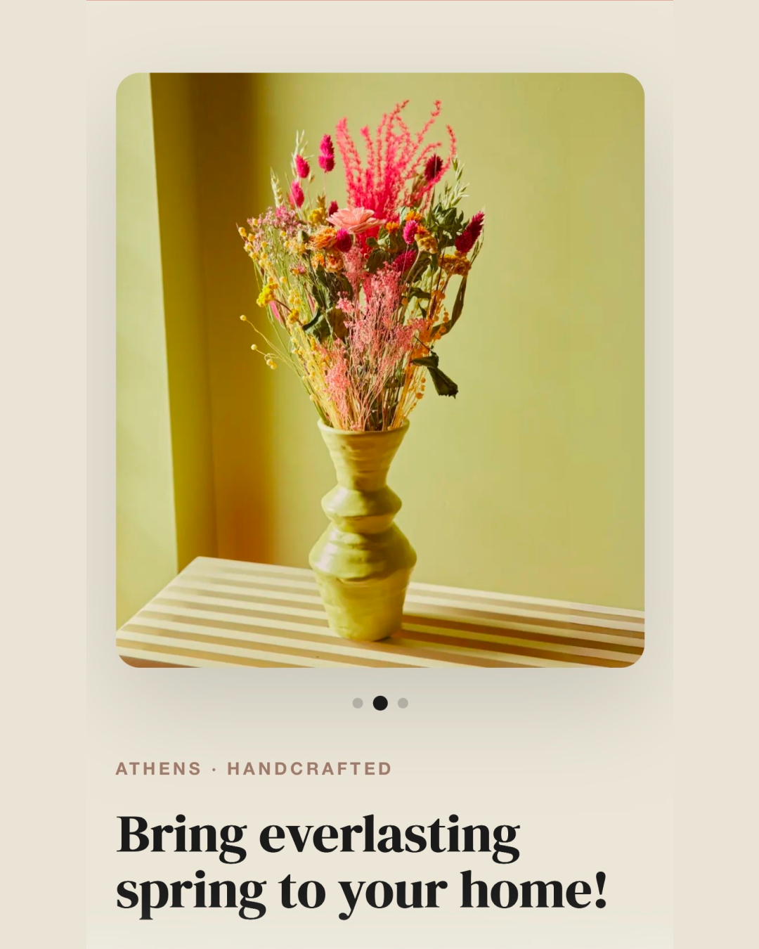
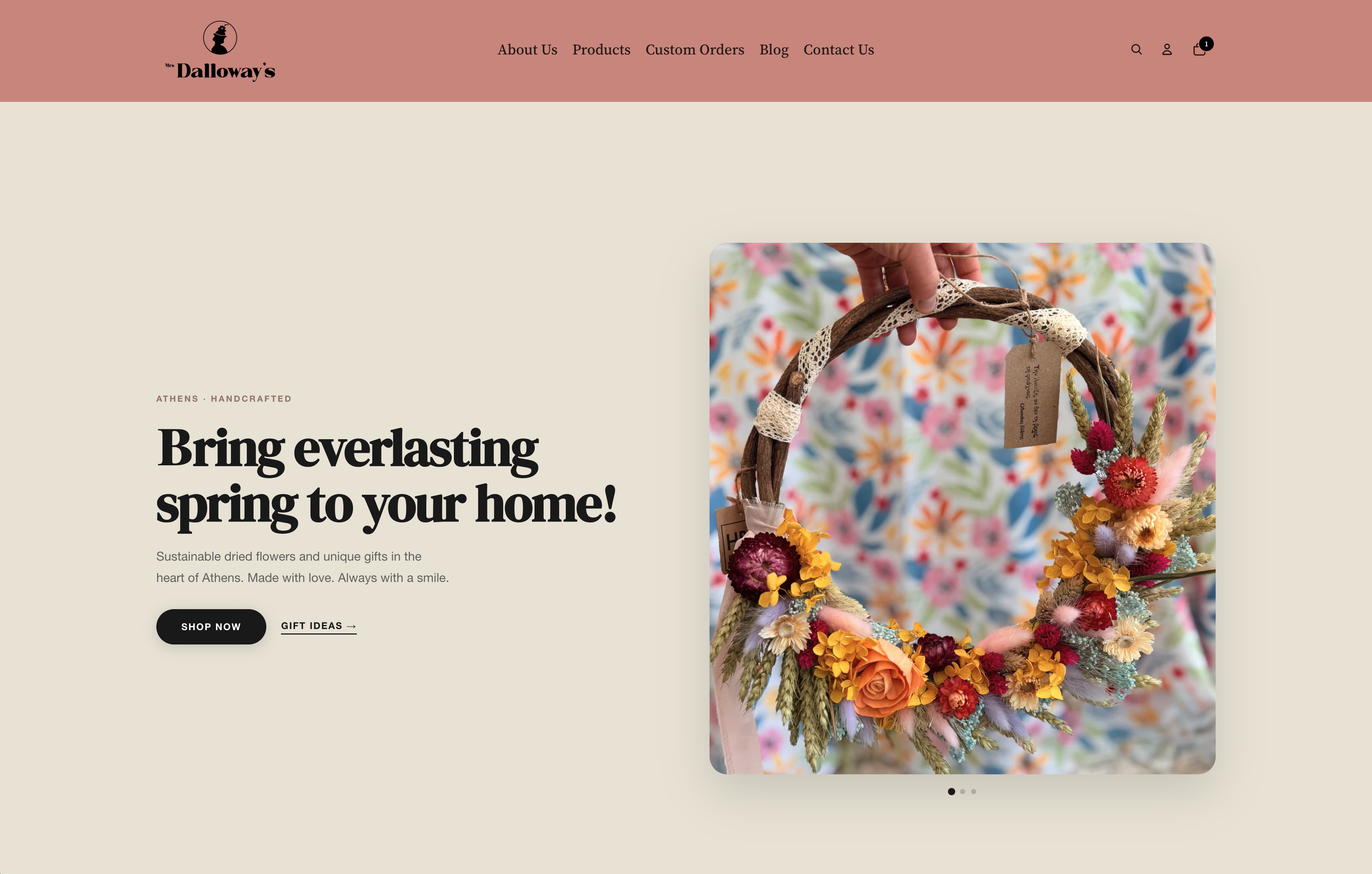
E-shop homepage
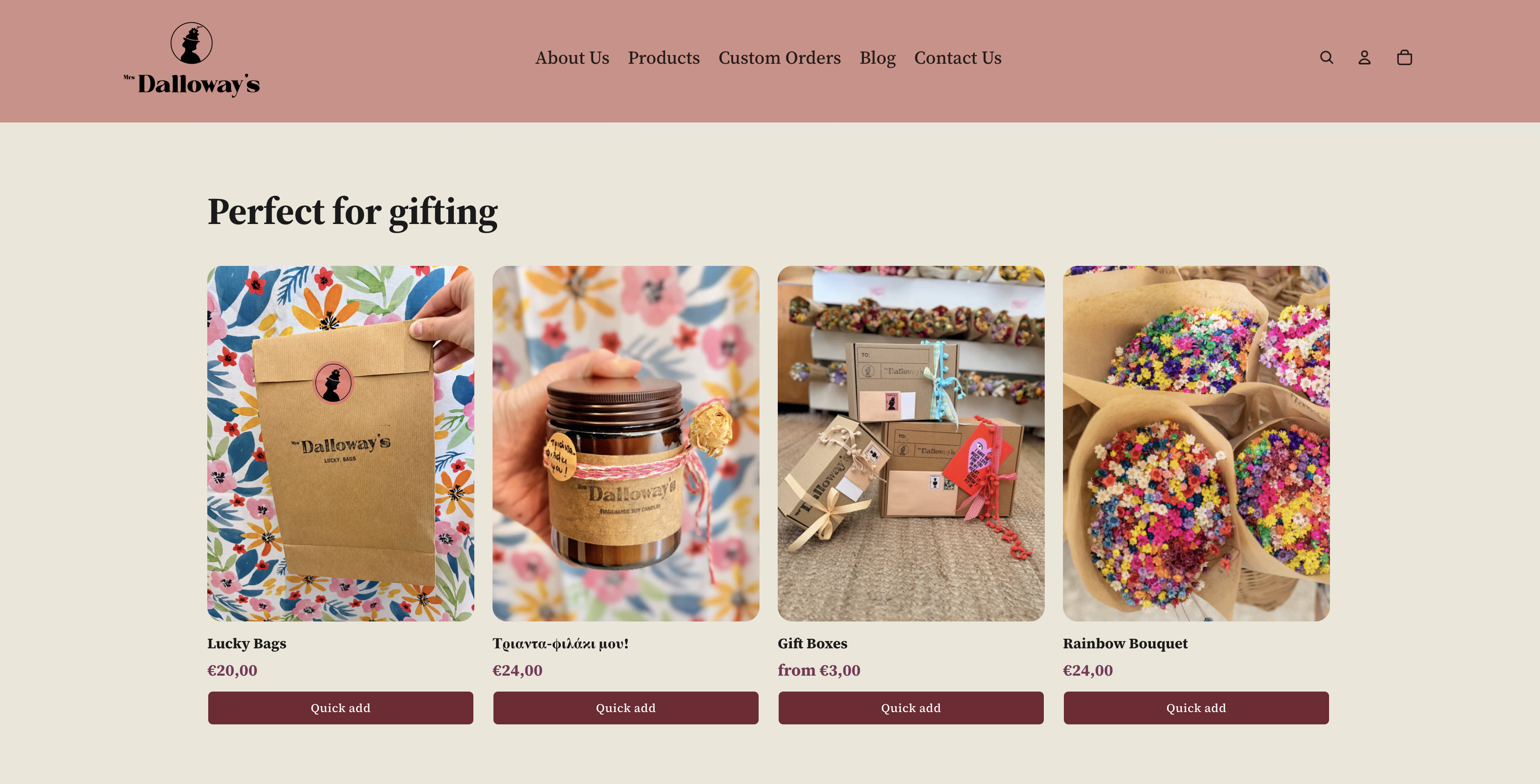
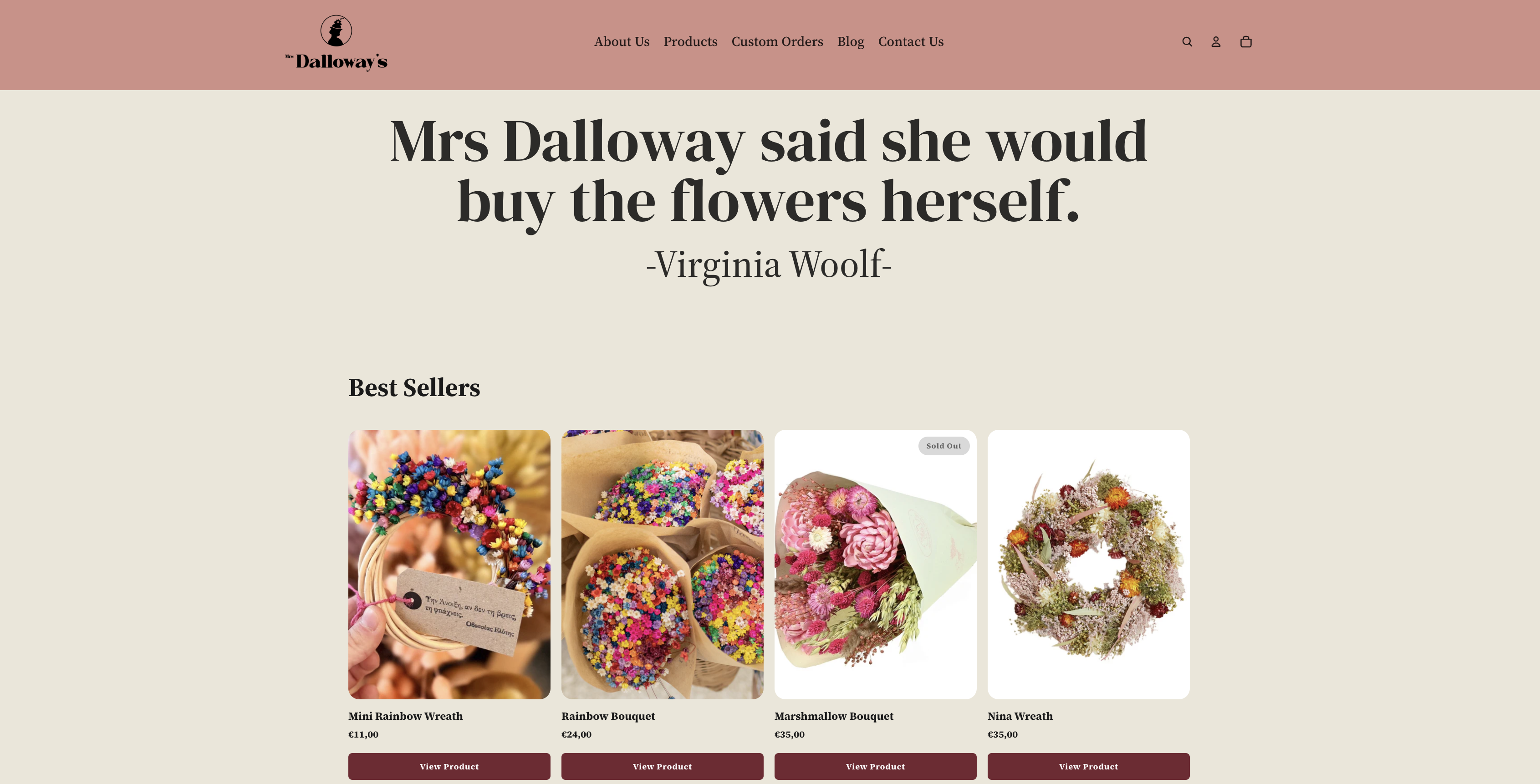
Product showcase
case study
A beautiful, high-converting e-shop designed to turn casual browsers into loyal customers.
Mrs Dalloway's had a curated product selection and a loyal local following — but no online store. Customers kept asking where they could buy online, and every day without an e-shop was leaving revenue on the table.
The challenge wasn't just building a shop — it was building one that felt as curated and elegant as the brand itself. A generic template wouldn't cut it. This needed to feel premium, personal, and effortless to browse.
E-shop homepage
Product showcase
We started by understanding Mrs Dalloway's customers — what they value, how they shop, and what makes them trust an online store enough to buy. That research shaped every design decision.
The e-shop was designed with large, editorial-style product photography at the centre, clean navigation that makes browsing feel effortless, and a checkout flow stripped of every unnecessary step. We optimised for mobile first, knowing that's where most of the traffic would come from.
Every product category was thoughtfully organised, and the overall visual language kept the brand's warm, sophisticated personality intact — it feels like walking into the physical store, just online.
Category pages
Checkout experience
"The shop looks exactly like I imagined it — maybe even better. Customers keep telling me how easy it is to browse and buy. That's exactly what I wanted."
The e-shop launched with over 200 products, fully optimised for search engines and mobile devices. Within the first month, conversion rates exceeded expectations — visitors weren't just browsing, they were buying.
Mrs Dalloway's now has a revenue stream that works around the clock. The shop runs smoothly, looks world-class, and gives customers the same curated experience they'd get in person — from anywhere in the country.